Voting Resources
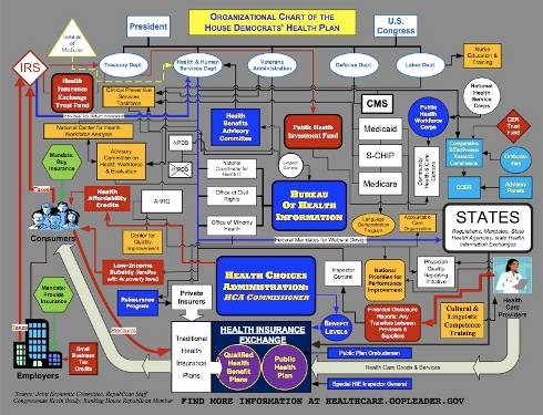
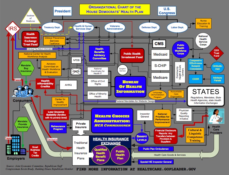
Congressman Kevin Brady's Healthcare Flowchart: What the Democrats Don't Want You to See
by Andy Adams on July 26, 2009 at 12:31 PM
 Why are the Democrats so upset about Rep. Kevin Brady's (R-TX 8th) health care reform chart that they are willing to use House rules to prohibit its dissemination?
At first glance, Brady’s chart resembles a board game: a colorful collection of shapes and images with a web of lines connecting them.
Sounds Harmless enough, but why are the Democrats so anxious to prevent the public from seeing it?
But a closer look at the image reveals a complicated menagerie of government offices and programs that Republicans say will be created if the leading Democratic health care plan becomes law.
Looks like congratulations are in order to Rep. Brady; the Democrats, by trying to prevent it from being distributed, are giving his chart exactly the sort of publicity it deserves. We are only too happy to oblige as well.

Comments
healthcare chart for insurance companies
Where can I get a chart of the current system?
If the chart of the current